Theme images by Storman. Powered by Blogger.
Showing posts with label css. Show all posts

Sunday, 13 November 2016

How to create transparent overlay on background image

- No comments
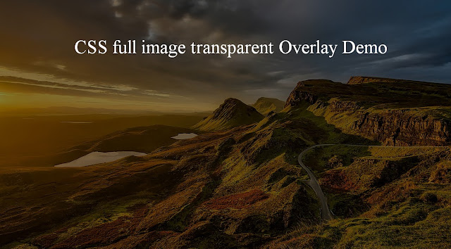
image overlay example
 
        Full-screen image based homepage is the very popular design concept and it is adapted by many websites. Whenever web designer adds the full-screen image on the landing page, a requirement to add text or other contents, over it comes into the picture. But directly adding the text on the image is not a good idea and this makes user experience bad.

This is where adding overlay on the image comes. If you want to add content on the image first create overlay than put content on top of it. Here I gave one example, there is much more use case where you can use an overlay for better user experience.

See here what I am talking about View demo

In this post, I am going to share you how you can use CSS to create overlay on the image.

Let’s go step by step

STEP 1: First I am going to create HTML file and basic HTML structure where I will be writing my code.

<!DOCTYPE html>
 <html>
  <head>
         <title>Overlay demo</title>
  </head>
  <body>
   <!-- add your code here -->
  </body>
 </html>

STEP 2: Next I will reset default CSS. So look into given code how you can do same.

body, html {
    margin: 0;
    padding: 0;
    border:0;
    height: 100%;
    font: inherit;
    vertical-align: baseline;
}

STEP 3:  Create an outer div with the background image and make 100% so it can occupy full screen of the browser window.

<div id = "main-img"></div>

#main-img{
 background-image: url("images/back.jpg");
 background-size: cover;
 background-position: center center;
 position: relative;
 height: 100%;
 width: 100%;
 top:0;
 bottom: 0;
}

STEP 4: Create another div inside the outer div and make it position absolute. Add the CSS given below for inner div.

<div id = "main-img">
 <div id = "img-overlay"></div>
</div>

#img-overlay{
 position: absolute;
 height: 100%;
 width: 100%;
 top:0;
 bottom: 0;
 background-color: rgba(0,0,0,0.5);
}


STEP 5: Create content tags as many you want and position them based on your requirement. Here I am using  <div> to add text on the image.

<div id = "main-img">
 <div id = "img-overlay"></div>
 <div class = "img-text">CSS full image transparent Overlay Demo</div>
</div>

.img-text{
    color: white;
    font-size: 50px;
    text-align: center;
    width: 100%;
    position: absolute;
    margin: 100px auto;
}

You can see the demo and get complete code here.
Source Code

Congratulations, you learnt something new. Now it’s time to go and try on your project.

Happy learning :-)

Sunday, 2 October 2016

Create Loading icon using CSS

- No comments
      "Loading icon" or "Loader" are frequently used in web applications to show, the complex process is running behind the screen. Mostly, GIF images are used to create loader but they can be heavy and take the time to load in the browser.So one of the best alternative  to avoid heavy GIF is using CSS to create loader.

 In this post, I  will show you  how to create the loader for your application using CSS. Let us start step by step

STEP 1: Add loader div inside <body> tag
       
            <!DOCTYPE html>
            <html>
                     <head></head>
                    <body>
                                  <div class="loader"></div>
                                 <div class = "loadText">Loading..</div>
                    </body>
           </html>

STEP 2: Add given CSS inside <style> tag or in CSS file where you are managing your CSS.

.loader {
  margin: 50px;
  border: 5px solid #ebeef0;
  border-radius: 50%;
  border-top: 5px solid #0BDAA1;
  width: 100px;
  height: 100px;
  -webkit-animation: spin 1s linear infinite;
  animation: spin 1s linear infinite;
}

@-webkit-keyframes spin {
  0% { -webkit-transform: rotate(0deg); }
  100% { -webkit-transform: rotate(360deg); }
}

@keyframes spin {
  0% { transform: rotate(0deg); }
  100% { transform: rotate(360deg); }
}

.loadText{
  font-size: 20px;
  margin-left: 70px;
  color: blue;
}

STEP 3: Save and load this in browser
       
Here is the output you will get into your browser.

Now understand what CSS is doing in this code.

Circle for loader is created using "border-radius : 50%"  and Green color loading part is created using "border-top: 5px solid #0BDAA1;" where 5px is border size.remaining loading part is created using  "border: 5px solid #ebeef0;" .

Next is animation, which is responsible for spinning the loader with 1-second animation speed for forever and  "@keyframes spin" defines the rule for the loader.

To experiment with the loader you can give border-left,border-right, border-bottom and border-top altogether or with any combination.

Click here to see working example.
View Demo

I hope you learned something and enjoyed the post.